


Cumulative sum graphs are quality control charts that are possibly the most frequently used for monitoring clinical-care processes.
One of their main advantages is the use in rare cases and in events with low incidence, where it would be necessary to obtain a large sample and a long follow-up time with conventional statistical methods, which is impossible in certain cases. This is also why they are useful for studying learning curves, the introduction of new technologies and, in general, for assessing the quality of care outcomes themselves, because their profile is sensitive to very subtle changes in trends (positive or negative), which would not be observed with other methods.
On the other hand, their use can be expanded beyond quality control or monitoring, which is a new aspect in clinical research.
Las gráficas cumulative sum (CUSUM) se engloban dentro de gráficas de control de calidad, son posiblemente las que mejor se adaptan y las más utilizadas en la monitorización de los procesos clínico-asistenciales.
Una de sus principales ventajas es su empleo en casos raros y en eventos con baja incidencia, en los cuales sería necesario obtener una muestra y un tiempo de seguimiento amplio, imposible en determinados casos, mediante métodos estadísticos convencionales. También por ello, son útiles para estudiar curvas de aprendizaje, la introducción de nuevas tecnologías y, en general, para valorar la calidad de los propios resultados asistenciales, porque su perfil es sensible a cambios de tendencias (positivas o negativas) muy sutiles en los resultados, que no se observarían con otros métodos.
Por otra parte, su uso se puede expandir más allá de lo que es el control o la monitorización de calidad, aspecto que resulta novedoso en investigación clínica.
Statistical techniques for quality control were developed for the first time in the 1920s by Walter Shewhart. Due to their successful application in the American weapons industry during World War II and afterwards in the Japanese Industrial Revolution, during the 1950s these techniques began to be used in the field of medicine, specifically for monitoring laboratory results for clinical analysis or blood banks.1,2 Currently, interest in these quality control techniques is rising, both for auditing (monitoring) clinical processes as well as medical treatment outcomes.3 The field for their application is unlimited, as any human activity is susceptible to being quantified and, therefore, monitored to improve quality.
Basically, these techniques are used to monitor a process while it is underway, done visually using control charts. Assuming it is true that a picture is worth a thousand words, then a chart communicates data better than a table with an amalgam of figures. In this manner, if signs are observed that indicate a problem (i.e. a significant deviation from what was planned or is desirable), the process can be stopped and checked immediately. Thus, the main objective of these charts is to identify the trend of the process, so that if the trend worsens the process can be halted to analyze possible errors. Likewise, if the trend is better than expected, it would be interesting to identify the reasons.
In any process, there is always an inherent variability, so that the result of each unit monitored is rarely the same or identical. The goal of the quality control processes is to define how much variability is acceptable for a process. Hence, maximum and minimum limits are set where the process is considered under control, thereby establishing an optimal range of variability that differentiates between the common or assignable variability of the process and excessive variability in order to guarantee the proper function of the process.4
In the interpretation of these control limits, we must not forget the possible appearance of statistical errors, as occurs in common statistical techniques. The type I or α error is a false positive, meaning that it rejects the null hypothesis when it is true. In the case of quality control charts, this would correspond with a correct value of the process that would be situated outside the range of common variability. Thus, if the accepted range were the mean±2 SD, a type I error would be 5%. The type II or β error is equivalent to a false negative, meaning that the null hypothesis is accepted when it is false. In quality control processes, this error appears when a result is ignored that is actually due to a special cause. Thus, the control charts are nothing more than the visual representation of the result of a test of statistical significance. Not only can we observe when the process deviates significantly from the desirable objective, but these charts provide the added advantage of allowing us to see whether the process has a trend that is approaching that critical deviation. As a result, we are warned before the alarm goes off.
Cumulative Sum ChartsWithin the wide range of statistical process control charts are the cumulative sum charts (CUSUM), which are possibly the charts best adapted to and most commonly used for monitoring clinical-care processes. They can also be used to compare results from various institutions, departments, or even individual subjects. These charts were described by Page5 in 1954 and are preferred in the field of medicine for their simplicity and ease of interpretation. In 1977, Herbert Wohl6 published in the prestigious New England Journal of Medicine the first article in which these curves were used for the purpose of monitoring a clinical process, specifically the changes in the body temperature of septic patients. Subsequently, this method of monitoring was extended to other clinical and surgical processes. Levar7 was the first to use this method for quality control in surgery, specifically to monitor the transposition of large vessels in neonates with or without associated defect in the interventricular septum and depending on the surgeon. Thanks to this and several other studies,8–11 its use is currently very widespread in the field of cardiac and thoracic surgery.
Cumulative sum, in fact, means adding the difference observed in the result of each unit of the process (each clinical case, for example) compared to a value that is considered the standard or quality objective. If that difference for each unit is cumulatively organized in the chart in the order of the execution or according to another sorting criterion, the graph will show the tendency of the process to either separate from or approach the established objective.
Following the indications of bibliographic references, these charts can be constructed in simple spreadsheets (Excel or SPSS), although they can also be obtained automatically with specific statistical programs (STATA version 12 for Windows).
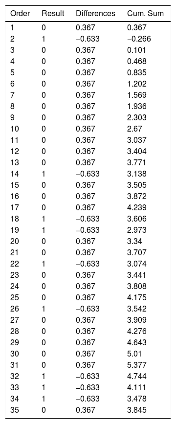
Example 1Table 1 and Fig. 1 visually exemplify the construction of a CUSUM chart. They represent an urgent surgical intervention whose final result has a quality indicator of 36.7% deaths. Initially, the patients are temporarily placed in order with their result; in this example 0=living and 1=death. Subsequently, the difference between the result obtained (0 or 1) and the expected result (quality indicator: 0.367) is calculated for each patient. Finally, the cumulative sum of these differences is determined, in which 0 represents the quality indicator, and the data are presented in a chart. In this example, we see that there is an increased risk of mortality in approximately 12 cases, after which the trend stabilizes.
Example of CUSUM Chart.
| Order | Result | Differences | Cum. Sum |
|---|---|---|---|
| 1 | 0 | 0.367 | 0.367 |
| 2 | 1 | −0.633 | −0.266 |
| 3 | 0 | 0.367 | 0.101 |
| 4 | 0 | 0.367 | 0.468 |
| 5 | 0 | 0.367 | 0.835 |
| 6 | 0 | 0.367 | 1.202 |
| 7 | 0 | 0.367 | 1.569 |
| 8 | 0 | 0.367 | 1.936 |
| 9 | 0 | 0.367 | 2.303 |
| 10 | 0 | 0.367 | 2.67 |
| 11 | 0 | 0.367 | 3.037 |
| 12 | 0 | 0.367 | 3.404 |
| 13 | 0 | 0.367 | 3.771 |
| 14 | 1 | −0.633 | 3.138 |
| 15 | 0 | 0.367 | 3.505 |
| 16 | 0 | 0.367 | 3.872 |
| 17 | 0 | 0.367 | 4.239 |
| 18 | 1 | −0.633 | 3.606 |
| 19 | 1 | −0.633 | 2.973 |
| 20 | 0 | 0.367 | 3.34 |
| 21 | 0 | 0.367 | 3.707 |
| 22 | 1 | −0.633 | 3.074 |
| 23 | 0 | 0.367 | 3.441 |
| 24 | 0 | 0.367 | 3.808 |
| 25 | 0 | 0.367 | 4.175 |
| 26 | 1 | −0.633 | 3.542 |
| 27 | 0 | 0.367 | 3.909 |
| 28 | 0 | 0.367 | 4.276 |
| 29 | 0 | 0.367 | 4.643 |
| 30 | 0 | 0.367 | 5.01 |
| 31 | 0 | 0.367 | 5.377 |
| 32 | 1 | −0.633 | 4.744 |
| 33 | 1 | −0.633 | 4.111 |
| 34 | 1 | −0.633 | 3.478 |
| 35 | 0 | 0.367 | 3.845 |
Result (0=living; 1=death).

If deviation limits are established, we can detect the precise moment in which this deviation becomes statistically significant, which would mean that the process has become “out of control”. In a certain way, they are like stock market charts, although what accumulates is the difference of an index compared to the previous value, either in hours or days, while in the CUSUM differences accumulate compared to a reference value. In any case, what is shown is the trend of the result with respect to the sorting criterion, whether time-related or otherwise.1,2,12,13
The main advantages of these charts are their simplicity, intuitive visual interpretation and the ability to detect changes in trends. By being able to distinguish anomalies not explained by the common variability of the process, these graphs can be applied to identify which sections of a result a certain factor influences, to a greater or lesser degree.14 In this regard, it is necessary to point out that control charts do not identify by themselves the causes of a special or assignable deviation. The identification of these causes is part of a separate research process, but at least they are the fastest and safest way to know that something undesirable is happening.
Moreover, one of the main advantages is the use of CUSUM in rare cases and in events with a low incidence, in which it would be necessary to obtain a sample and a long follow-up time (which is impossible in certain cases) using conventional statistical methods. However, using CUSUM charts, the process can be monitored in real time from its inception.15 Also for this reason, these charts are useful for studying learning curves.1,9,13,16 In this way, they have advantages over other methods: results are updated after each procedure, different objectives can be applied depending on the surgeons, and the process is monitored in real time. In the same way, they can be used for the introduction of new technologies and, in general, to assess the quality of the treatment results themselves, because their profile is sensitive to changes in trends (positive or negative) that are very subtle in the results and would not be observed with other methods.14,17–21
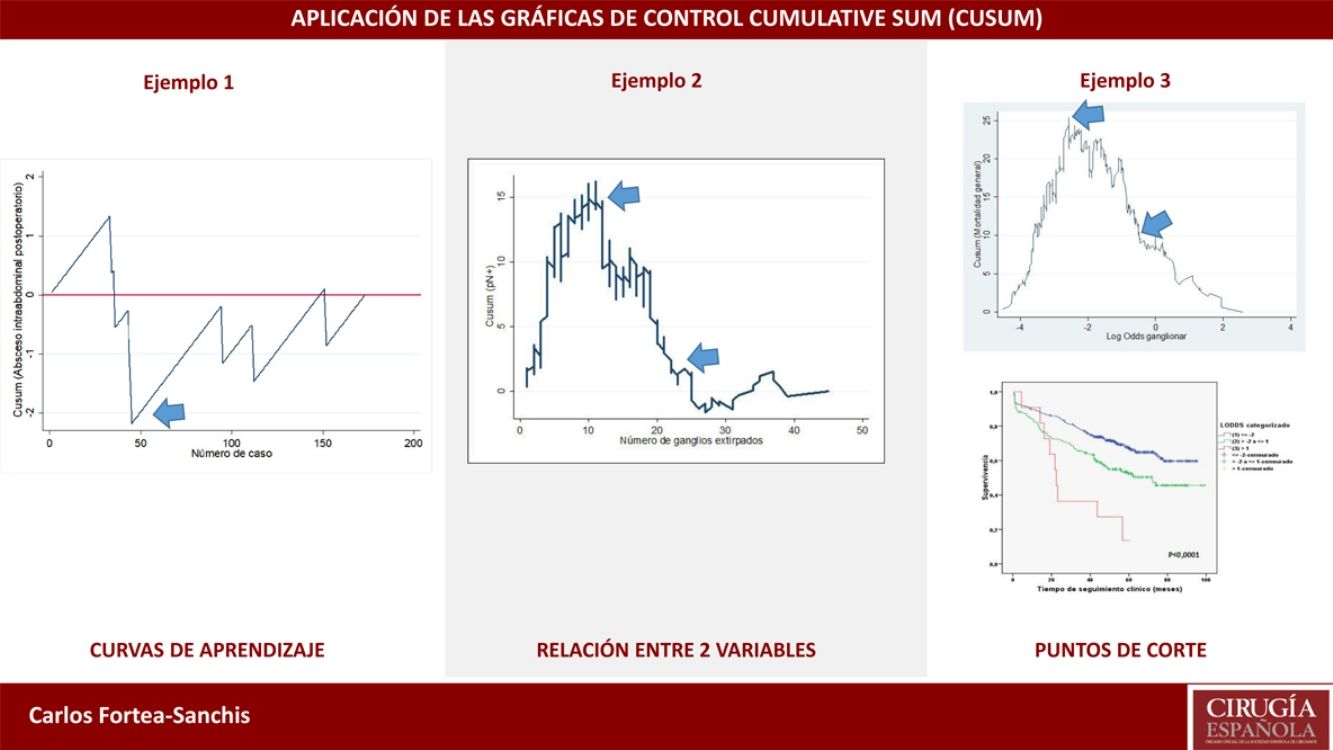
Example 2In this example, we will demonstrate their use in learning curves, in this case for laparoscopic appendectomy in patients at a general hospital. In order to determine correct surgical technique, postoperative intra-abdominal abscesses were not to exceed 5%. Thus, as seen in Fig. 2, the risk for the appearance of intra-abdominal abscesses reached approximately 40 cases (ascending line), after which there was a decrease in the risk of occurrence, dropping below line 0 for the rest of the time sequence. This means that, at this hospital in particular, 40 cases were necessary for the group of residents to overcome the learning curve for performing laparoscopic appendectomies.
Other Uses
The use of CUSUM charts can extend beyond what is quality control or monitoring, which is novel in clinical research. For example, they can be useful in research about the relationships between two clinical variables of interest, beyond the average relationship that may exist between and is usually analyzed by conventional statistical tests. For example, it is possible to determine how the probability of finding lymph nodes affected by a tumor increases as more lymph nodes are dissected in a lymphadenectomy; or after how many dissected lymph nodes that probability no longer clearly increases; or to plot the trend of how age, year by year, causes more postoperative complications; or after which day of the evolution of a pathology the trend toward an increased number of deaths occurs; or after how many surgeries does the trend toward increasingly longer surgical times reverse (learning curve); etc.
This type of CUSUM chart was proposed by Royston20 and represents the cumulative difference between the general prevalence of the indicator analyzed in a series of cases, and the probability of a result calculated by logistic regression between 2 variables: one result (binary qualitative type located on the y-axis), and one predictor variable of said result (quantitative type located on the x-axis). By plotting the trend of the result from this relationship, one can observe when there are changes in the profile of the curve for each value of the predictor variable, especially if there is any substantial or extraordinary change. As always, line 0 of the graph represents the reference value that in this case corresponds to the general prevalence of the factor analyzed.
Example 3If we study the relationship between lymph node involvement of a malignant tumor (binary variable, yes/no) and total number of lymph nodes analyzed, the reference value will be the general prevalence of affected lymph nodes in a series of cases. When the main objective is to evaluate the trend of the result and its changes with respect to the predictor variable, it is not strictly necessary to establish control limits, since this objective is not related with quality. If the curve adopts an inverted U shape, this indicates that the more lymph nodes analyzed, the higher the probability of finding affected lymph nodes, whereas a non-inverted U shape would indicate otherwise. If the profile of the curve oscillates, this would indicate no clear relationship between the predictor variable and the result variable. After this general assessment, if there is an obvious relationship between the variables, we should observe the profile changes shown by the curve. Based on the mathematical basis of the calculations, the interpretation of the results should be approximate; in other words, a change in trend on the curve occurs approximately at a certain time, and not exactly at that moment. It is, therefore, a more detailed form of analysis than that provided by any statistical test based on average figures (mean, median, etc.) of the variables studied.4
In Fig. 3, it can be seen that, in general, the more lymph nodes analyzed, the more likely it is to find positive lymph nodes. More specifically, up to about 12 analyzed nodes, the cumulative difference between the general prevalence of affected lymph nodes and that found for each number of lymph nodes analyzed (expected/observed) tends to increase. That is to say, we are actually obtaining fewer affected lymph nodes than would be expected. After 12 lymph nodes analyzed, this difference decreases in a sustained manner, meaning that we have already obtained more positive nodes than expected, but the cumulative probability of obtaining affected lymph nodes given the general average represented on line 0 still runs above it, meaning that it is increasing as more lymph nodes are analyzed. After about 26 lymph nodes analyzed, the cumulative probability of obtaining more affected lymph nodes than expected tends to stabilize; thus, for each node analyzed after 25–26 nodes, the probability of finding affected nodes does not vary substantially. In practical terms, we could deduce that, in this tumor, when less than 12 nodes are analyzed there is a risk of understaging the patient lymph node stage, and after some 26 lymph nodes analyzed this risk practically disappears in terms of cumulative probability. Therefore, on one hand it would be desirable not to obtain less than 12 lymph nodes in any case and, on the other, the minimum number of lymph nodes that should be obtained for absolutely safe lymph node staging according to the data available in the series analyzed would be approximately 25–26 lymph nodes.

Another use of this type of chart, parallel to the one described and with the same mathematical basis, is the calculation of clinically established optimal cut-off points in continuous variables to be categorized for statistical analysis, given their ability to detect these subtle changes in trends. Thus, the objective is to establish optimal cut-off points for the creation of risk subgroups, based on the risk itself rather than on mathematical artifices aimed at maximizing statistical power (such as percentile cut-offs). The main problem with staging methods based on obtaining risk scores is to establish the correct cut-off points to define different prognostic subgroups. The frequently used division by percentiles obtains very similar subgroups in terms of the number of cases. Therefore, the sample size is maximized for each, as is the statistical power as a result, which is why it is easier to obtain statistically significant differences. However, the disadvantage is that is mixes cases with different risks within each subgroup, resulting in low clinical significance.
Example 4The log odds of positive lymph nodes (LODDS) is a lymph node staging method defined as the logarithm of the quotient between positive and negative lymph nodes+a constant, to avoid singularity. In Fig. 4, the cut-off points were calculated for the LODDS in colon cancer. At first glance, there is an obvious accumulation of risk for general mortality to a LODDS around −2, after which this risk drops to -1, followed by a final phase with more moderate risk reduction. Thus, these trend changes will define 3 sub-groups of risk for LODDS: low risk=LODDS<2; intermediate risk=LODDS from −2 to −1; and high risk=LODDS>−1. The 3 groups present differentiated survival, as can be seen in Fig. 5.


In summary, CUSUM charts have multiple applications in the field of surgery, from quality control to obtaining cut-off points for quantitative variables that demonstrate real clinical significance. The generalized use of these charts would be beneficial to monitor care activity as well as to improve clinical research.
Conflict of InterestsThe authors have no conflict of interests to declare.
Please cite this article as: Fortea-Sanchis C, Escrig-Sos J. Técnicas de control de calidad en cirugía. Aplicación de las gráficas de control cumulative sum. Cir Esp. 2019;97:65–70.