


Statistics is a science that provides precise techniques for collecting and sorting information made easy by tools and methods for further analysis.
The object of descriptive statistics, from sample data, is to describe the most important characteristics, by which we refer to those amounts that provide information on the topic of interest which we are studying.
Statistics is the set of procedures and techniques used to collect, organise and analyse data, which are the basis for making decisions in situations of uncertainty. Statistics are divided into descriptive and inferential.
Descriptive statistics refers to the collection, presentation, description, analysis and interpretation of data collection. Its purpose is to summarize these from a set of values. Descriptive statistics is the method of obtaining data set conclusions about themselves. It can be used to summarise or describe any data set, either a population or a sample.
Inferential statistics refers to the set of techniques used to gain conclusions from the population through manipulation of the sample data. It is the process of making generalisations about the population from a representative sample of data.
Inference distinguishes parameter estimation and hypothesis testing. The statistical analysis is the whole process of organisation, processing, reduction and interpretation of data to make inferences.
When analysing data from a sample, the most important thing is the presentation of numerical and graphical summaries of the information. These summaries represent characteristics of the sample. This is what we call “statistics”. There are a variety of numerical and graphical summaries that can be calculated with data from the sample. Each of these provides a description of some aspect of self-interest.
The reasons to study samples instead of populations are diverse and among them we can point out:1
- •
Saving time. Obviously studying fewer individuals takes less time.
- •
Following on from the above point, it saves costs.
- •
Studying all the patients or people with a particular characteristic, in many cases, can be an inaccessible or impossible task to do.
- •
Improving the quality of the study. With more time and resources, observations and measurements of a small number of individuals can be more exact and plural than if we had to do it with a population.
- •
The selection of specific samples allows us to reduce the heterogeneity of a population to indicate the criteria of inclusion and/or exclusion.
This work tries to show some of the main concepts regarding statistics that will help us to explore and describe, at first, our data.
Types of variablesThe nature of the observations will be of utmost importance when choosing the most appropriate statistical method to tackle their analysis. The classification of variables, in general terms, will be in two types:1–3 quantitative variables or qualitative variables.
Quantitative variables are numerical scales that measure the amount of something. There are two types of numerical scales: continuous and discrete.
Continuous numerical variables can take any value between two points (e.g., pollution index), so they are values with decimals.
Discrete numerical variables take values from discrete scales, integer values (e.g., patient age).
Qualitative variables, however, are scales that measure, as their name suggests, qualities. They are divided into two parts: nominal and ordinal.
Nominal qualitative variables in the data values are categories (e.g., sex of patient). The ordinals are qualitative variables in which its categories follow an order of importance or risk (e.g., severity of the allergy).
If the qualitative variable has two categories of measure then it will be called dichotomous or binary.
The measurement scales or types of variables determine the descriptive statistical methods, wheteher numerical or graphics, for analysis and summary of the information.
Qualitative variablesNumerical summaryMeasuring the data in a categorical or qualitative level, what is done is to count the times that each category is given in the variable. This is a count of frequencies. Qualitative data can be described by: number of cases or absolute frequencies, proportions or relative frequencies, percentages and rates.
Absolute frequencies, relatives and percentagesThe absolute frequencies are equal to the number of observations in the same category in the variable (e.g., the number of allergic people in the sample).
A proportion or relative frequency is a part divided by the total, it is the number of observations with a given characteristic divided by the total number of observations (e.g., the proportion of allergic people in relation to the total sample).
where a is the amount of people with allergy and b is the people with no allergy.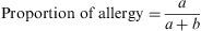
The percentage is the ratio multiplied by 100%.
The rates are proportions used in a multiplier (e.g., 1000, 10,000, etc.) and they are calculated for a period of time (e.g., annual, biennial, etc.).
where a is the people with allergy over a period of time and b the population at risk for allergy in the same period of time.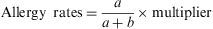
Rates are very useful and important measures in the clinic and in epidemiology. Next we describe the most used rates in medicine.
Mortality rate → The numerator is the number of deaths in a certain period of time. The denominator is the total number of people at risk of dying during the same period, the population in this period.
Morbidity rate →The numerator is the number of people that in a given period of time have a condition; the denominator is the total number of people at risk in the same period, eg: the population in this period.
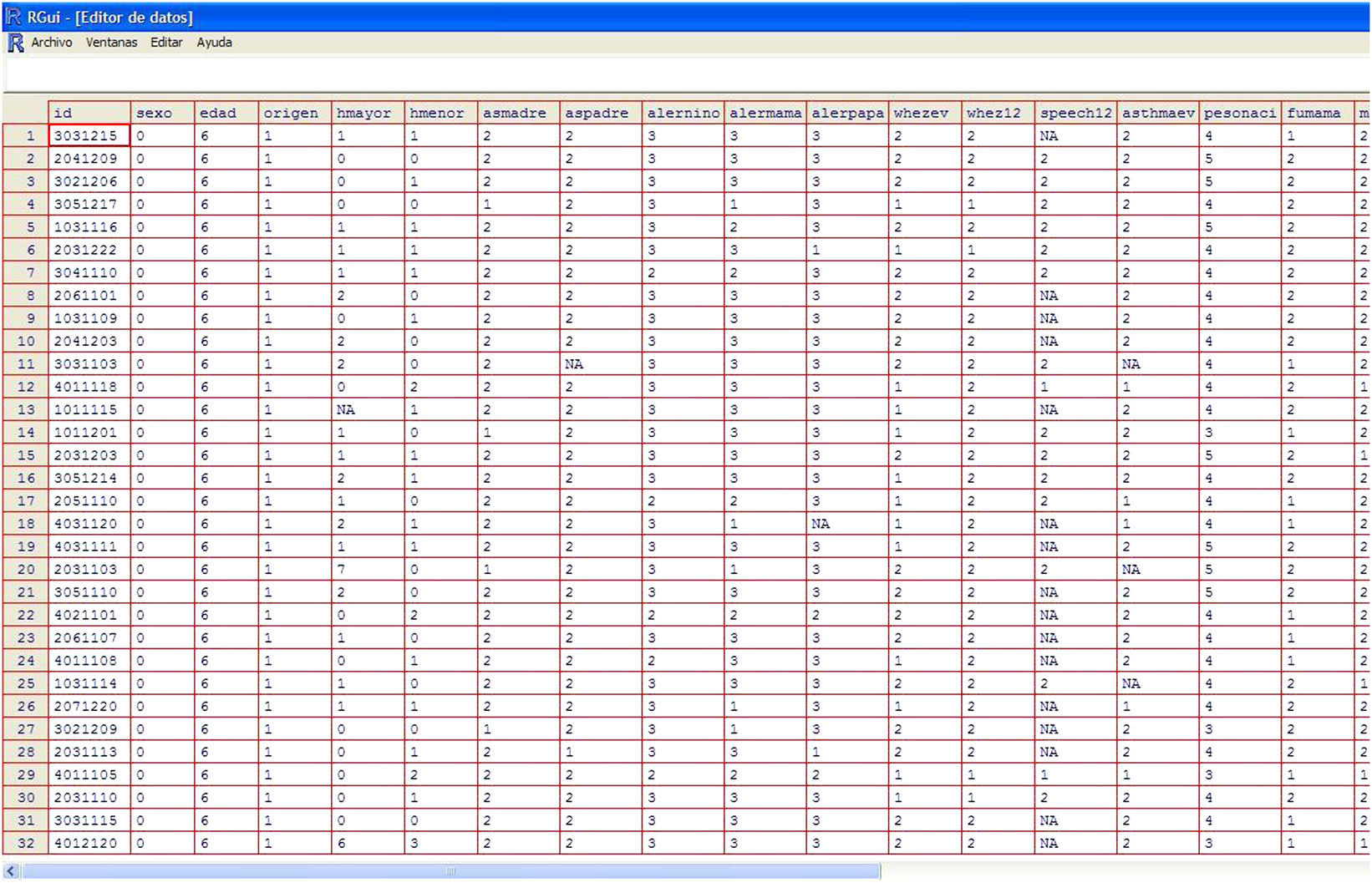
ExampleWe present a database (Figure 1) containing the results of 205 patients from a paediatric population and which displays the different variables of asthma, allergy, and sociodemographic data of children and their parents.

The following example will present the outputs of the database to describe qualitative variables.
First of all is to import the database into the statistical program that will be used for the analysis. When this database is imported we must debug it,4 then we must identify the qualitative variables and their measurement categories and, if necessary, we will label the categories of these variables.
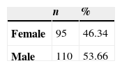
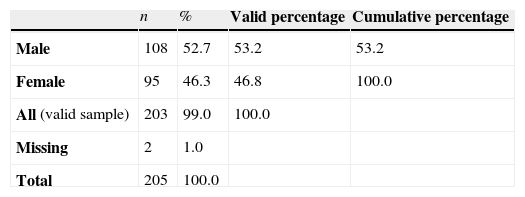
The table summarizes the information of the qualitative variables, in this case for the gender variable, which is presented in Tables 1 and 2. These describe numerically the nominal qualitative variable Gender.
The first column shows the qualitative variable analysed and its categories. The second column displays the absolute frequencies, the number of times it presents the category man and the category woman, and, afterwards, the percentage or relative frequency that this number is equivalent to, respect to the sample.
Table 2 presents more calculations of percentages based on the Gender variable, in this case with missing values in the variable.
The first percentage or real percentage is calculated over the total sample or non-losses in the gender variable. For example, in the event that there were any cases in which the gender of the patient had not been recorded. The percentage applied in this case coincides with the real, so it is taken into account when there are missing values in the variable to describe, in this case the valid percentage will not coincide with the actual percentage because it is calculated over the valid sample (sample without losses) and not over the total.
There are programs or statistical packages that also present the cumulative percentage in their outputs. In order to calculate these kind of frequencies or percentages it should be taken into account to analyse the statistical variable it has to be ordinal qualitative or discrete quantitative (otherwise there is no sense in referring to this measure).
The cumulative absolute frequency of a variable value is the number of times a value less or equal to the variable one has appeared in the sample. Thus, the relative frequency or cumulative percentage is calculated in the same way but with valid relative frequency. The following table (Table 2) is an example of the above.
Graphical summaryThe quality of graphics published in scientific journals is much better than one is used to finding in the press. Even so, we can find cases where the graph is not best suited to summarize the information or too much information is presented so its interpretation is complicated.
Graphics can be edited in almost all programs, including Office, and we can make changes over their image or we can change colours, add comments, absolute or relative values of each category, and so on.
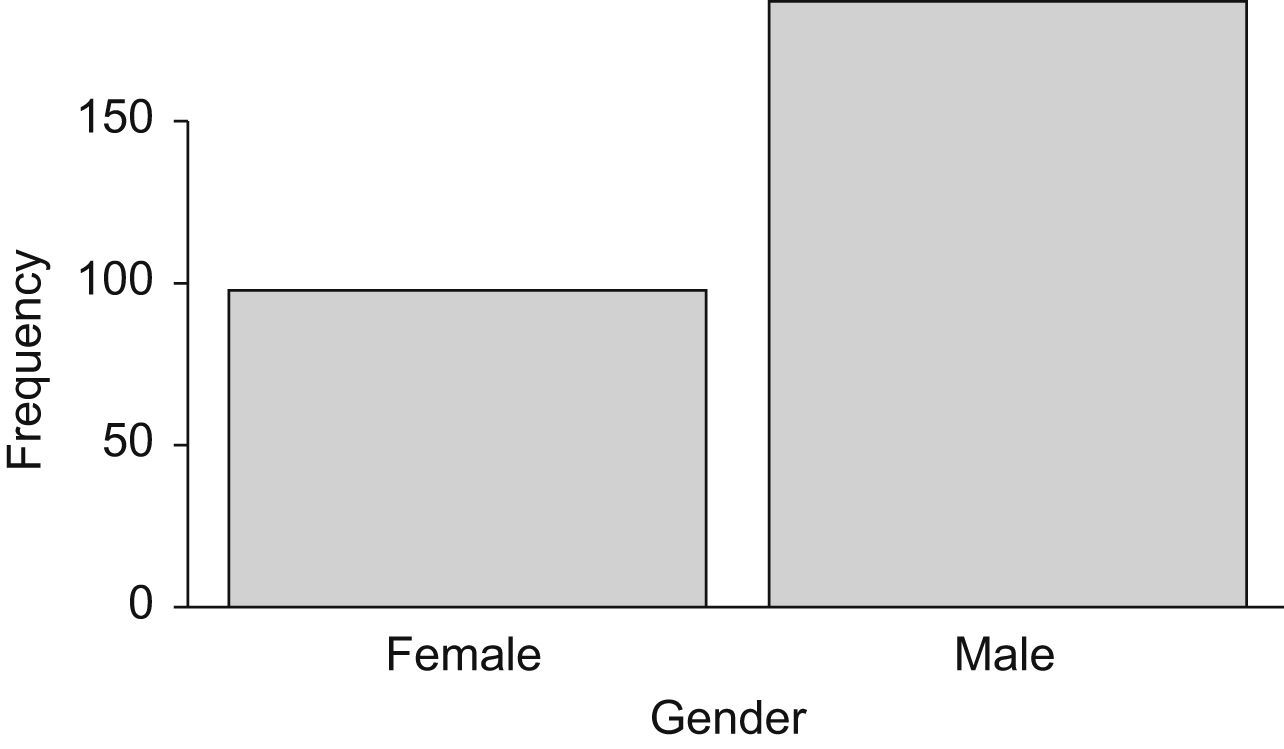
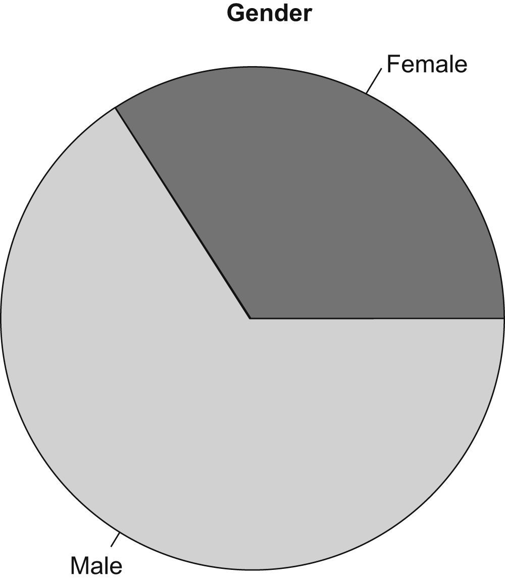
Graphic information, just as numerical information, depends on the type of variable to summarise. So, for qualitative variables the graphics to use are: the bar chart and the pie chart.
The bar chart (Figure 2) represents on the X-axis, the categories of the variable, and on the Y-axis, absolute or relative frequencies of each category.

Continuing with the previous example, the gender variable is described graphically.
The pie chart (Figure 3) divides a circle into as many portions as categories exist, each category is represented with an arc of circle that is proportional to its absolute or relative frequency.

In both figures the proportion of the categories in the sample is shown. There is also the option of representing the absolute frequency.
Quantitative variablesNumerical summariesDescriptive measures used for quantitative variables can be divided into three groups: position, dispersion and shape measurements. Position measurements indicate where data are grouped, dispersion measurements inform us about their variability, and shape measurements, give us an idea of their disposition.
Position measurementsMean: is the most widely used position measure. Although there are several types, the most common is the arithmetic mean. This measure represents the centre location of the data, being a very representative value to the data's frequency distribution, telling us to what value the sample data are distributed.
The arithmetic mean is obtained by summing all sample values and then dividing by the total size. If we denote a sample of data x1, …, xn, the mean value is:

In the event that the data sample does not fit a normal distribution, or even outliers exist, the mean is not very representative. The assumption of normality must be tested before any data analysis, with the Kolmogorov-Smirnov or Shapiro Wilks goodness of fit test. If data does not fit a normal distribution, it is more appropriate to calculate another measure, such as the median.
Median: is the middle value of a sample, separating the lower half from the higher half of the data. Its value can be found by arranging the data from lowest to highest value. The median is the value in the position (n+1)/2 if n is odd, and the average among those in the positions n/2 and (n+1)/2 if n is even.
As an example, we consider a sample of grass pollen levels obtained during a week in the Madrid region: 21, 11, 5, 28, 7, 33, 20. In this case, the mean would be:
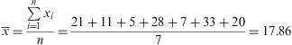
If we added a new data higher than the rest, obtained one day with abnormally high levels, 95g/m3, the new calculated mean would be:
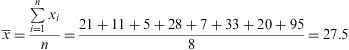
We note that this irregular data distorts the value of the calculated measure. However, if we arrange the data from smaller to largest, the median for the data set would be the average between the value in fourth and fifth position, i.e. 20.5.
This indicates that 50% of our sample values would be below 20.5g/m3, and 50% above. As shown, the median value reflects more accurately the reality of our data. For normal distributions, the median value and the mean will be very similar.
Mode: the most frequently occurring number in the sample. In a continuous distribution, it would be an interval, not a point value.
Percentiles and quartiles: values used to divide the sample, leaving below or above them, a percentage of the data distribution. For example the 75th percentile is the value which leaves below 75% of the data. Percentile definition is used when we consider the division of data sample as percentages from 1 to 100. When the division is into four equal parts, quartiles are the values that define each quarter of the sampled population. Q1, Q2, Q3 and Q4 quartiles correspond to P25, P50, P75, P100 percentiles. In turn, 50th percentile is equivalent to the median.
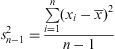
Dispersion measurementsVariance: indicates the dispersion of data around its mean. As we usually work with samples, we calculate the sample variance, as follows:
The greater the variance, the greater the data dispersion will be around its mean. Variance is measured in square units, which is not very intuitive, so often its square root, known as the standard deviation, is used.
Standard deviation (sd): is calculated as the square root of the variance, and although it also measures the dispersion or data variability, it is expressed in the same units as the variable. If we only know the mean distribution, we will not have enough information; it should always be accompanied by a dispersion measure, usually the standard deviation (mean±sd).
Coefficient of variation (CV): indicates the dispersion of each variable from the mean. The closer it is to zero, the lower dispersion the data have. Coefficient of variation can be used to compare the homogeneity of two populations or two different variables, since it is a relative measure unaffected by the units in which data are collected:

Interquartile range (IQR): is calculated by the difference between the third and first quartiles, giving us the range of values found among 50% of our sample data. It is an appropriate measure to show the data dispersion when it does not fit a normal distribution, or outliers which make the average not representative exists, and therefore, the median we should calculated.
Shape measurements
Skewness: is a measure of the symmetry of the variable, used to show the data distribution around its mean. A skewness of zero indicates that sample values are equally distributed around the mean, meaning a symmetrical distribution (i.e. in a normal or Gaussian distribution, data are shown bell-shaped). Negative skewness indicates that data distribution is concentrated on the right of the mean, named left-skewed. A positive value indicates more data on the left of the mean, named right-skewed.
Identifiying outliersOutliers are data uncommonly distant from the rest of the sample. One method for identifying outliers is by calculating percentiles. Outliers are considered to be those which fall outside the range:

A graphical way to verify the existence of outliers is through the box-and-whisker diagram or boxplot. The boxplot is a diagram representing a box whose edges are 25th and 75th percentiles, with the median of the data and lines or whiskers that are P25−1.5 IQR and P75+1.5IQR quantities, identifying as outliers the points that fall outside this range.
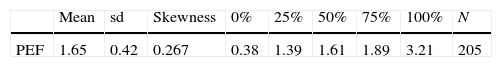
Example: peak expiratory flow (PEF) values in litres per second
In this sample, the mean of PEF for patients is 1.65±0.42 litres per second. The CV must be calculated by dividing the standard deviation between the mean, if the program does not provide its automatic calculation.
CV=0.42/1.65=0.25, which indicates that data are slightly scattered around the mean, since it is a value close to zero. The skewness coefficient gives 0.267, a very small value, so we can consider a symmetric distribution of PEF.
The median or 50th percentile is equal to 1.61, showing that 50% of patients in the sample have less than 1.61l/s, and 50%, more. If we calculate, for example, P75, it shows that 75% of patients have a PEF lower than 1.89l/s.
In this data, the interquartile range would be P75−P25=0.5; thus 50% of patients in the sample are grouped into a range of 0.5l/s.
We can also see the minimum and maximum variable value by looking at percentile 0% and 100%, 0.38 and 3.21l/s, respectively.
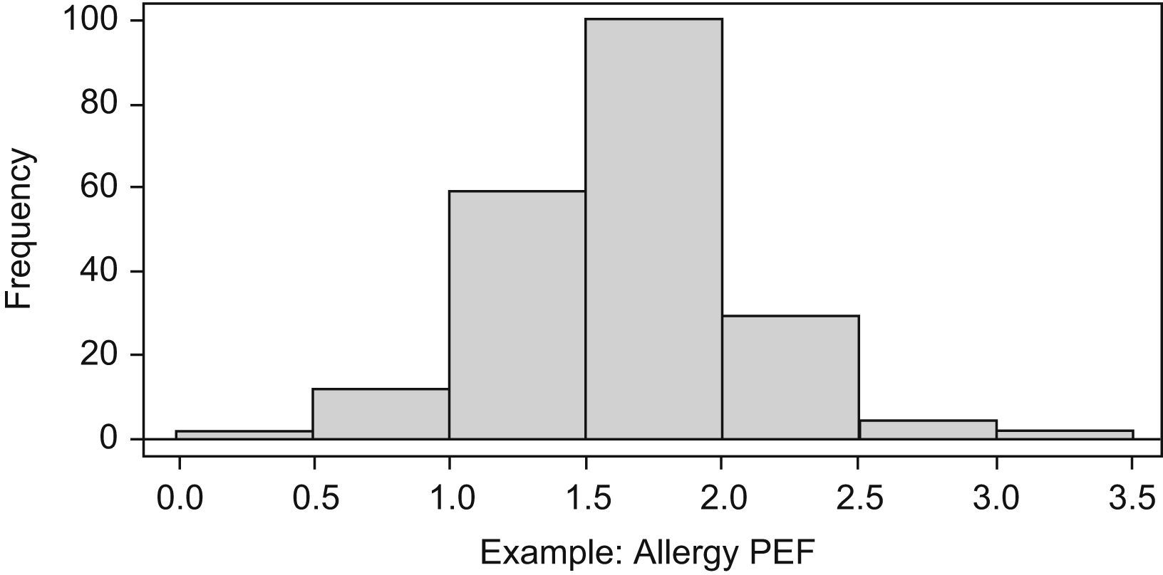
Graphical summaryAs with qualitative variables, there are several types of graphs to represent quantitative variables, such as the histogram, the stem and leaf plot, the box-and-whisker plot and the error bars.
The histogram (Figure 4) shows on the horizontal axis, the intervals of data distribution; each interval corresponds to a rectangle with height proportional to the frequency. The frequency is contained in the Y-axis.

In Figure 4, the Y-axis represents relative frequency but it is also possible to represent absolute frequency values.
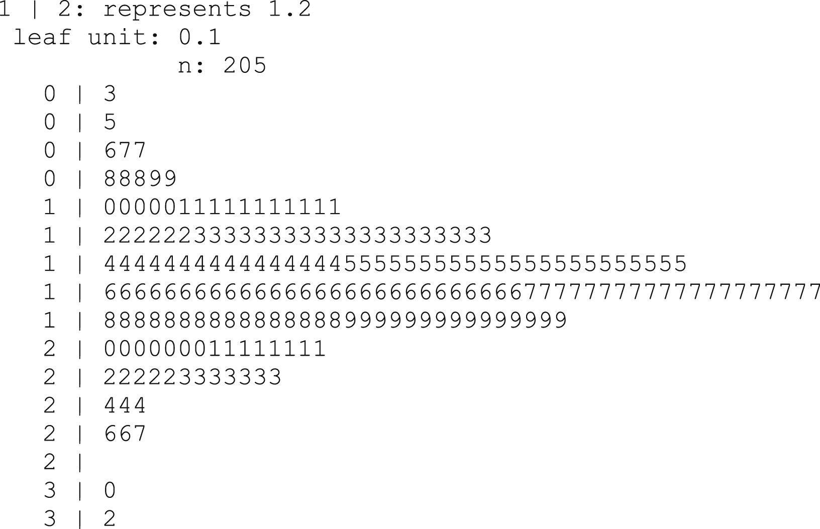
The stem and leaf plot (Figure 5) gives a lot of information: a histogram can be seen clearly, and how often each value appears in the sample.

The stem indicates the first digit of the actual value of the variable; we obtain the second one of the leaves (i.e. the third row presents 3 cases in which PEF take values of 0.6, 0.7 and 0.7l/s).
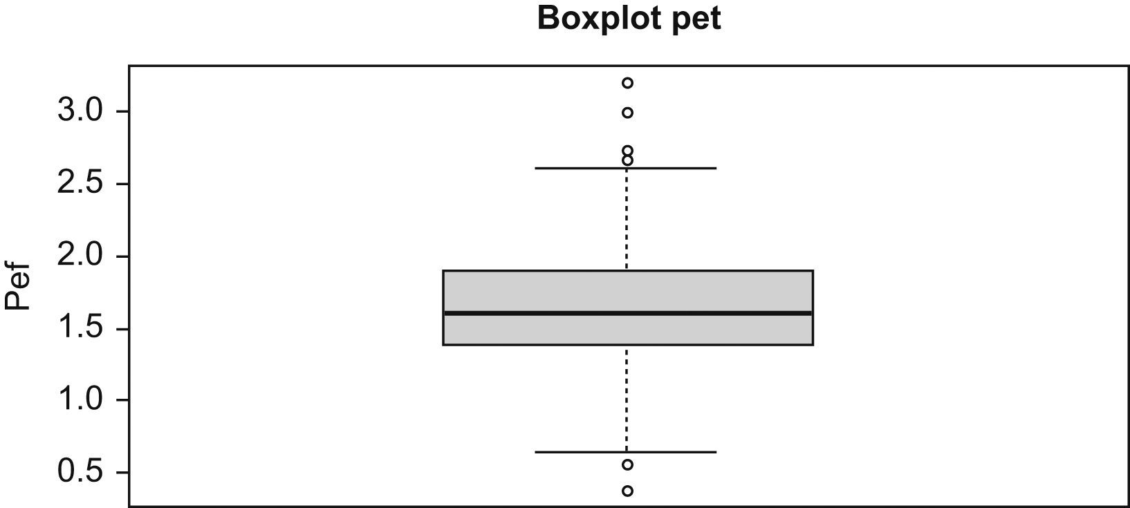
Box-and-whisker or boxplot (Figure 6) is very useful to identify outliers and to compare graphically two population distributions.

The lower end of the vertical box represents the first quartile (value that leaves 25% of the sample below). The top is the third quartile (value that leaves 75% of the sample below, or 25% above). The median is the horizontal line dividing the box into two parts. Above and below the box, two lines represent the values corresponding to P25−1.5IQR and P75+1.5IQR. Data outside the lines or whiskers are considered outliers. In the example (Figure 6) we can see four odd values above, that is, which values are atypically higher than the rest, and two below, with lower PEF values. Statistical programs identify these values in our database.
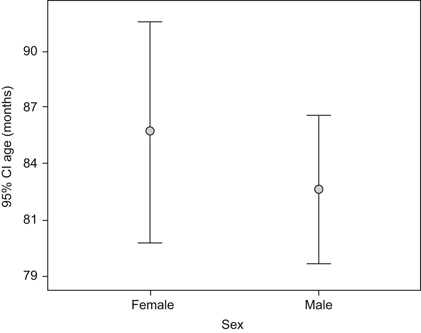
The error bars plot (Figure 7) represents the mean with standard deviation or standard error (s.e.). It can also be used to represent the mean and its confidence interval.

The X-axis shows the qualitative categories of the variable represented by age, and the Y-axis shows the 95% confidence interval of the mean age. The halfway point of the bars represents the mean age for each category of the sex variable. Above and below the mean the confidence intervals of age by sex are shown.
Any of these graphics may be a good way to represent information as long as its interpretation is correct.
Histograms are represented with the normal curve to describe the distribution of the variables, which would indicate whether the numeric variable is normally distributed.
The stem and leaf plot is used with the same objective as the histogram with the advantage that we know the more frequent values in the sample.
When variables do not follow a normal distribution, the box-and-whisker plot is more suitable than the previous ones, and also will be useful to identify outliers in the sample.
Error bars are used for normal variables, as they represent the mean and give us an idea of the dispersion or heterogeneity of the sample data.
Confidence intervalsIn the context of estimating a population parameter, a confidence interval is a range of values that contains the parameter value with a given probability.5 The confidence level, denoted by 1−α, is the probability that the true parameter value is in this interval. The probability of error is called the significance level and is the α value. Intervals are generally built with confidence 1−α=95% (or significance α=5%). Intervals with significance level at 10% or 1% are less frequent.
Confidence intervals utility:
- 1.
A confidence interval provides more information than a point estimate when we want to make inferences in population parameters.
- 2.
Confidence interval's width is determined by a fixed significance level, data variability and sample size.
- 3.
It is possible and advisable to construct confidence intervals for odds ratios and relative risks in case-control or cohort studies.
If a variable X has distribution N (μ, σ2), or for any distribution when the sample size is large (n>30), the confidence interval for mean at 95% level is given by:
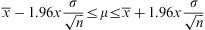
The result is a range that includes the true parameter (μ) in 95% of the occasions.
Confidence interval at 95% for proportionsIf p⌢has a distributionN(p,(p(1-p))/n) the confidence interval for a proportion at 95% level is calculated by the following expression:
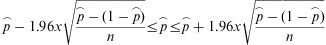
The result is a range that includes p 95% of the time.
SoftwareThere are several programs specialised in statistical calculations, ranging from commercial software packages such as SPSS,6 Stata or SAS, to freely distributed ones such as R, R Commander,7 used for the examples in this article, or Epidat, which have been developed for years and it is widely used by the scientific community. In addition, for basic statistical calculations, Microsoft Excel can be used for almost all the descriptive computations and graphics mentioned in this article.8 Menu options to access descriptive statistics and graphs in some of the more popular software are listed below:
- •
SPSS
Menu-Analyze-Descriptive Statistics
Menu-Graphics
- •
Microsoft Excel
Insert-Function-Statistics
Insert-Graphic
- •
R-Commander
Statistics-Summaries-IPSUR-Numerical Summaries
Statistics-Summaries-IPSUR-Frequency distributions-Graphics
Particularly noteworthy is the importance of collecting information and storing it with computer software compatible with the statistical package that will be used for further analysis.
Once the information is transferred to appropriate software, it is necessary to perform a good debugging of the database to avoid incorrect results, which can lead us to wrong conclusions.
All epidemiological study requires a descriptive analysis prior to any other that will help orient the reader about the baseline characteristics of the population under study. The correct choice of measurements to be used, depending on the type of variables and the appropriate use of tables and graphs will help us to synthesize information and present the results in a clear and understandable way.
Conflict of interestThe authors have no conflict of interest to declare.
Manuela Expósito Ruiz and Sabina Pérez Vicente are research technicians with a contract supported by the Carlos III Health Institute.